Web Design Psychology: How Colors & Layouts Influence Users
You only have fifty milliseconds. That’s all it takes for a visitor to decide if your site is worth their time. In that blink, they form impressions about your professionalism, your credibility, and your relevance. But what’s driving that snap judgment?
The truth is, browsing involves unconscious mental processing as much as it does looking.
This is where psychology meets design. When you understand how people see and feel about colours, layouts, and fonts, you can build sites that feel natural to use. Instead of designing by instinct, you’ll be designing with insight.
In this blog, we’ll explore the psychological foundations of effective web design and how elements like colour, structure, and typography guide user perception and action.
Let’s start by looking at the most immediate element users respond to: colour.
The Role of Colour in UX and User Behavior
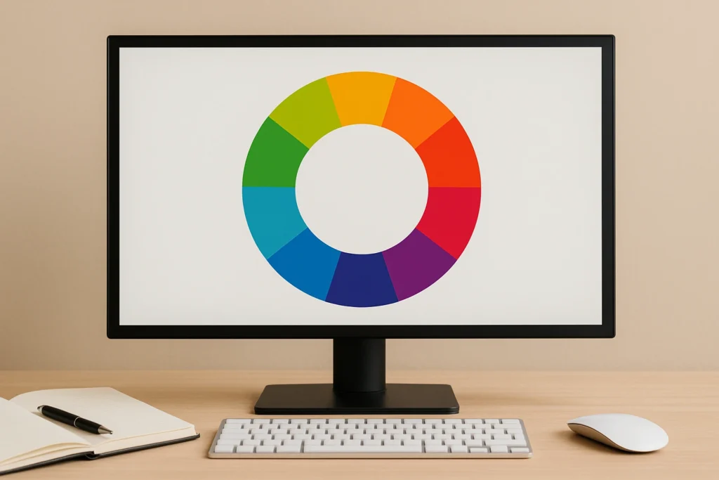
When designing for user experience, colour acts like a visual cue. It directs attention, creates consistency, and influences first impressions. Research even links specific colours to trust and action. Let’s look at how you can make the most of it.
Why Your Colour Palette Matters for User Perception
Before a user reads a headline or interacts with a menu, they are already responding to your site’s colour scheme. These responses happen quickly and often subconsciously. The brain links colours with emotions, and in a digital setting, this link helps determine whether users feel safe, rushed, curious, or uncertain.
For example, a finance site that uses bright red may unintentionally create a sense of tension or alertness. However, if that same site used navy blue or a soft grey, it could communicate calmness and trustworthiness instead. This change in feeling can greatly influence whether users want to stay or leave.
Common Colours and Their Psychological Effects
If you know what feelings colours usually bring, you can use them more strategically. Here are some common colours and what they often communicate:
- Red: Often associated with urgency, excitement, or errors. While it can draw attention and energise, too much can create anxiety. It’s frequently used in sale tags and warning messages.
- Blue: Known for creating a sense of calm and reliability. It is a favourite for brands in finance, healthcare, and tech because of its association with stability.
- Green: Tied to themes like growth, wellness, and safety. It’s commonly seen in success messages or brands focused on the environment or well-being.
- Yellow: Adds energy and optimism but should be used sparingly. Overuse can feel harsh or overwhelming. Ideal for highlighting or accenting elements.
- Monochrome (Black, White, Grey): Communicates clarity, professionalism, and elegance. These are often used in minimalist or luxury-focused designs.
Each colour can influence how users feel about your content and what action they take next.
Context Matters: Culture, Accessibility, and Inclusion
While many colour associations hold in Western design, such as red meaning danger or urgency, they don’t always translate globally. Cultural meanings can vary quite a bit, and understanding those differences can make your design feel more inclusive and respectful.
For instance, in the United States and most of Europe, red is often used to signal a warning or highlight urgency, especially in sales or error messages. But in China, red is seen very differently.
It is a symbol of luck, happiness, and celebration, often used in weddings, festivals, and brand colours to bring positive energy. In India, red is linked to purity and tradition, and it is commonly worn by brides. Meanwhile, in South Africa, red can be associated with mourning and remembrance.
Accessibility also needs to be part of your colour decisions. A significant number of users experience some form of colour blindness. For these users, colour combinations like red and green can blur together, making key information hard to perceive. Designers can use contrast tools to ensure that text, icons, and interactive elements remain clear to everyone, regardless of their vision abilities.
Designing With Empathy
Thoughtful colour choices in web design are ultimately about empathy. Consider the wide range of situations your users might be in when they land on your site. They may be tired, unfamiliar with your brand, or using assistive devices. A well-chosen palette can lower anxiety, make information easier to digest, and build an emotional connection with your brand.
Designing with colour in UX means prioritising clarity and comfort for your users. When done well, it supports every other part of the user experience, helping visitors feel at ease and in control.
Once your palette sets the tone, your layout takes over, guiding where the eye moves, what stands out, and what gets ignored. The next section breaks down how layout impacts what users see and do.
Website Layout Psychology: How We Scan and Decide
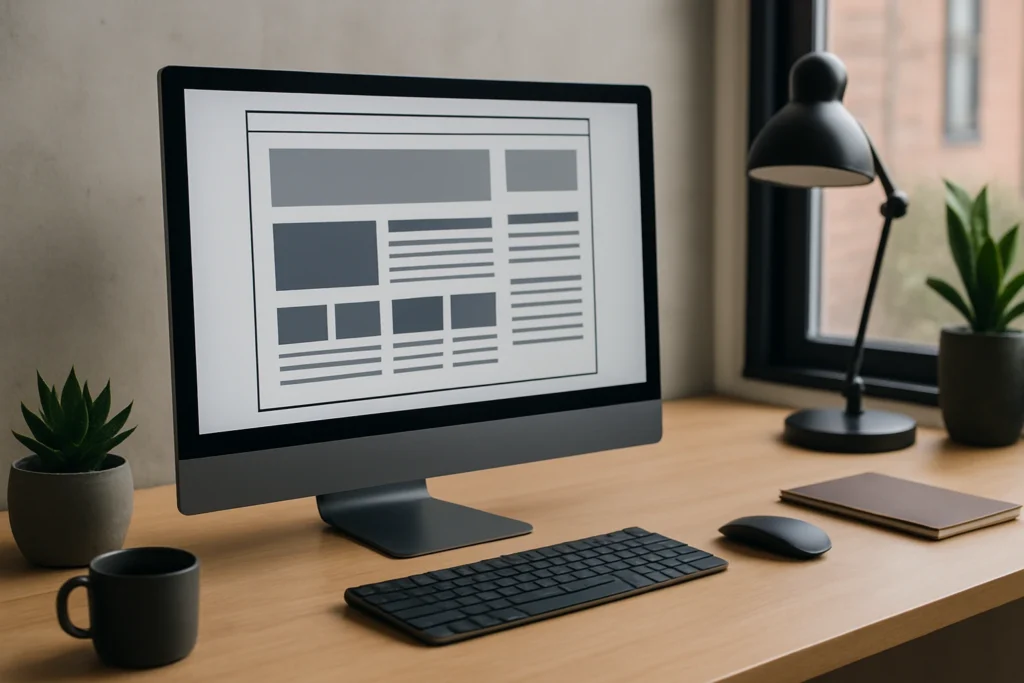
Colour sets the tone, but layout controls the experience for any web page. Users tend to skim pages, focusing on key areas shaped by the layout. Without good structure, even the best colour choices can’t save a confusing page. Let’s look at how layout directs user behavior.
Why Structure Matters
Our brains prefer order. If your layout is smooth, people will stay longer. It’s just a fact.
Short attention spans get the blame, but the real issue is cognitive ease. People want websites that feel simple and make sense fast.
How People Actually Scan
We don’t read web pages the way we read books. Most people scan. That’s why smart design follows patterns that mirror natural eye movement.
- F-pattern: Common on text-heavy pages such as blogs and search results. Users read the first few lines in full, then scan down the left side of the page, occasionally moving horizontally when something stands out.
- Z-pattern: Best for simpler layouts like landing pages. Users move across the top, diagonally down the middle, and across the bottom, forming a Z shape. This works well for placing headings, images, and calls to action.
Designing with these patterns in mind allows you to place key elements where users naturally look first.
Establishing Visual Hierarchy
Strong layout design depends on hierarchy and rhythm. Use bold headings to mark importance, group related content with spacing, and apply consistent alignment. Visual repetition builds familiarity and helps users orient themselves without having to think too hard.
And never underestimate whitespace. It’s the necessary breathing room that guides focus, adds emphasis, and reduces cognitive load.
If your layout feels smooth, your user feels smart. That ease builds confidence, and over time, trust.
Of course, layout alone can’t deliver clarity. A good layout gets users to the content, but what keeps them reading? Typography.
Typography in UX: How Fonts Influence Trust and Readability
Once your layout points users in the right direction, your typography takes over as the voice that tells your story. The font you choose can influence whether your message feels serious, playful, modern, or outdated. Here’s how:
What Your Font Says About Your Brand
Fonts are like voices. They change the mood of everything they say. You wouldn’t give a boardroom presentation in a party hat, right? The same logic applies to typefaces in UX.
Typography needs to align with your brand’s tone and the emotional response you want to evoke.
For example:
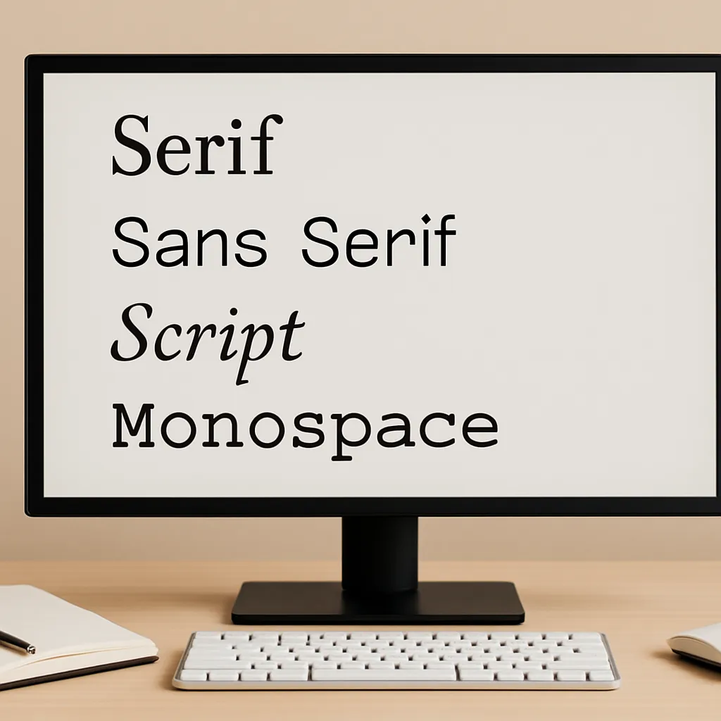
- Serif fonts: Fonts such as Georgia or Times convey tradition, authority, and reliability. They are often used by institutions, law firms, and editorial publications.
- Sans-serif fonts: These fonts, like Helvetica, Lato, or Open Sans, feel modern, clear, and accessible. These are popular in tech, SaaS platforms, and lifestyle brands for their simplicity and legibility.
How Fonts Affect User Concentration and Memory
Typography choices directly affect how your content is read and remembered. Poorly chosen fonts can increase mental fatigue, even if the message is clear.
Important elements of font usability include:
- Size: Text that’s too small strains the eyes and tires readers, especially on small screens. But if it’s too large, it can feel overwhelming, which makes it harder to scan.
- Line spacing: When lines are too close together, everything feels cramped. Giving your text enough breathing room helps the eye move smoothly from one line to the next.
- Contrast: If your site has good contrast, it helps all users (including those with vision issues) read clearly in different lighting. But low contrast can cause eye strain and make your content less accessible.
Making these things right makes reading easier. When users can read your content comfortably, they’re more likely to stay interested and keep going.
How Fonts Affect User Emotions and Brand Image
Typography also affects emotions. Fonts give off subtle signals that shape how users see your brand. A classic serif font can suggest history, sophistication, or trustworthiness. A rounded sans-serif font often feels friendly, open, and modern.
People pick up on these signals fast, usually without even realising it. Along with layout and colour, they help create a clear and consistent feeling for your brand.
That’s why your font choices are part of how your brand “speaks” visually. Before someone reads a single word, they’ve already got a feeling about your message. That first impression helps build trust, a clear understanding, and a connection.
To make a smooth user experience, these choices need to work as a team. When colours, layouts, and fonts work together with purpose, the design feels natural. This builds trust every time someone interacts with it. Let’s see how to bring it all together.
How to Create a Connected UX That Guides Users to Action
Great design doesn’t focus only on looks. The experience feels connected, clear, and trustworthy. Like a good story, a well-designed website has natural rhythm and flow. It guides users smoothly from one idea to the next without making them stop and wonder what to do. That sense of ease only happens when everything works together.
Why Cohesion Matters
When a site feels all over the place (fonts switching, colours clashing, and layouts shifting), it breaks the flow and throws people off. Users have to stop and figure out what’s going on. That pause can cause problems. Confusion creates friction, and friction drives bounce rates higher.
Imagine clicking into a site where the homepage uses a clean, minimalist layout with soft pastels, but the next page suddenly switches to bold colours, a cluttered sidebar, and an entirely different font.
Even if the content is useful, that visual inconsistency feels jarring. Users might question whether they are still on the same site or, worse, wonder if the page is secure or legitimate.
A smooth user experience avoids this by making sure all design elements fit together. This creates a feeling of comfort and familiarity that helps your site feel trustworthy and professional.
How Gestalt Principles Help
Gestalt psychology explains how people naturally interpret visual information. Our brains look for patterns, connections, and meaning. Smart design uses this to its advantage.
Here are a few important Gestalt principles that can improve your web design:
- Proximity: Keep related things close together so it’s clear they belong. For example, putting labels right next to form fields helps users quickly see what goes where.
- Similarity: Keep the look of similar elements the same. If all your main buttons share a colour and shape, users quickly recognise what they’re for.
- Continuity: Arrange things so the eye can move smoothly across the page. Straight lines or clear paths (like in a pricing table) make scanning easier.
- Closure: Our brains can fill in the gaps. If you show most of a shape or pattern, like a circle made of dots, people still see the full picture without needing all the details.
These techniques help users navigate your site without second-guessing.
Building Familiarity and Reducing Cognitive Load
Using the same fonts, spacing, colours, and button styles across your site creates a sense of rhythm. That consistency helps users feel comfortable, especially as they move from one page to another. When things are predictable, people feel more in control.
A consistent design also makes things easier to process. If users don’t have to figure out how things work on every page, they can focus on the content or action you want them to take.
When your design feels clear and consistent, it builds confidence. Instead of feeling lost or unsure, users feel like they know what to do, and they trust what they see.
This trust comes from careful design choices that understand how people think. To wrap things up, let’s look at why designing with the user’s thinking in focus is what makes digital experiences really stand out.
Final Takeaway: Design Websites with Psychology in Mind
Every part of your site (colour, layout, and fonts) helps guide how users think and feel.
When you understand the psychology behind design, you stop creating pages and start designing experiences. It invites visitors in, holds their attention, and guides them smoothly towards what you want them to do.
That’s what turns good design into great experiences. And that’s what makes users stay, return, and remember.