How to Turn a Minimal Budget Into a High Impact Artist Website
On average, clients spend 54 seconds scrolling through your site before they decide whether to reach out or keep looking. Meaning, your portfolio website can make or break getting hired as a creative.
Here’s something most Brisbane artists get wrong. They assume a proper website means spending $3,000 on a designer. And that’s totally wrong. You can actually launch a professional website for under $50 in your first month, domain name included.
In this article, you’ll see which platforms work best on tight budgets. You’ll also learn how to structure your portfolio so visitors browse multiple pieces instead of bouncing, and some smart ways to organise work by medium or series.
So let’s find out which approach converts browsers into buyers.
What Makes a Budget Artist Website Actually Work?
A budget artist website works when it loads fast, looks good on phones, and puts your best work front and centre. You don’t need fancy animations or complex features to make an impression. Rather, what you need is a site that guides visitors to your art without getting in the way.
Here’s what goes behind websites that convert from ones that get ignored.
Guide Visual Hierarchy Like a PowerPoint Presentation
Large hero images on your homepage grab attention immediately and showcase your strongest piece before anyone scrolls. That impact works best when it’s paired with simple navigation. A layout with 4-6 menu items helps people find what they need without hunting through dropdown menus or confusing layouts.
Along with that, when you add white space around your artwork, each piece gets room to stand out instead of competing for attention with everything else on the page.
Fast Loading Times Keep People Around
53% of web visitors leave if a page takes longer than 3 seconds to load (and nobody sticks around to see your work if the page won’t load).
Using compressed images helps pages load faster without sacrificing quality. Keeping plugins and scripts to a minimum also reduces page weight and ensures your site performs well even on slower internet connections.
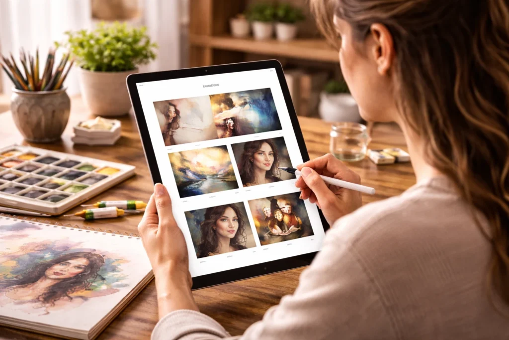
Mobile-Friendly Design Reaches More Viewers
Around 66% of art buyers browse portfolios on their phones while commuting or waiting in line at cafes. So when you have responsive layouts that automatically adjust images and text for different screen sizes, your carefully arranged desktop layout doesn’t break on a phone.
Also, touch-friendly buttons and menus make navigation easier because mobile users need larger tap targets than desktop mouse users do.
Budget Web Design Basics: Where to Start Without Overspending
Budget web design starts by focusing on essentials that directly support your bookings and visibility. You don’t need custom builds or flashy features to look professional and credible online. The goal is to invest in structure, clarity, and performance before spending on extras.
This is where your money should go in the beginning:
- Template Platforms: Squarespace, Wix, and similar builders cost $10-25 monthly instead of the $3,000 you’d pay a designer. These platforms include hosting, security, and updates in that package, and the pre-made templates are designed specifically for creatives.
- Domain Registration: Next, grab your domain name through Namecheap or Google Domains for under $15 per year. This is your website address, like “yourname.com.au”. You’re probably thinking domain registration sounds technical, but the whole process takes about five minutes.
- Free Templates: Most platforms offer dozens of free templates designed for artists and photographers, and they work perfectly fine for getting started. You can always upgrade to a paid template later if you want more customisation.
- Contact Page: A simple form can let potential clients reach you without hunting for an email address. It captures enquiries while keeping your personal email private from the entire internet. You can also include links to your social media accounts if you’re active on Instagram or Facebook.
- Core Pages Only: Launch with home, portfolio, about, contact, and blog. That’s it. You don’t need 15 different sections to make a good impression. These five pages give visitors everything they need to understand your work and get in touch.
Once you’ve got these basics sorted, you’ll have a functional site that doesn’t look like you rushed it together in an afternoon. So get something live first, then improve it as you learn what your visitors actually care about.
Platform Choices: Free vs Paid Options Compared
Picking the right platform saves you hours of frustration and keeps your monthly costs predictable. From our experience of building websites on these platforms, each option has trade-offs between ease of use, customisation, and price.
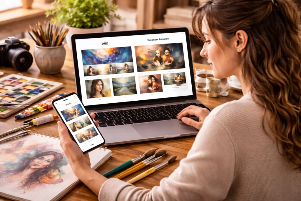
Take a look at how the main platforms stack up for artists on budgets.
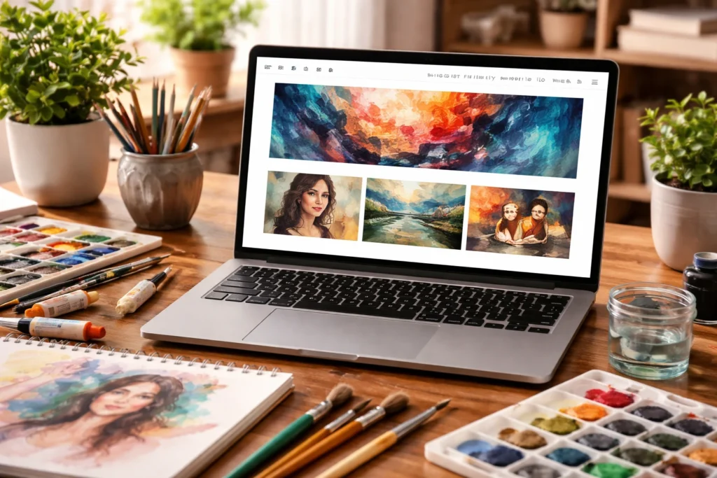
Squarespace and Wix for Quick Setup
These platforms work best if you want something live today without learning code. They’re popular with photographers and illustrators who’d rather spend time creating art than troubleshooting website problems.
These are the main features:
- Drag-and-Drop Builders: Create pages in hours without touching any code (unless you actually enjoy debugging CSS at 2 am). You can simply click, drag, and type to get a functional page that looks intentional instead of thrown together.
- Built-in Templates: These platforms give you dozens of templates designed specifically for creatives, so you’re not staring at a blank canvas wondering where to start. Plus, the layouts already work for portfolios, which saves you from reinventing the wheel.
- Monthly Costs: Expect to pay $16-30, depending on which features you need (like custom domains and extra storage space). The pricing is straightforward, and you know exactly what you’re paying each month without surprise charges showing up.
Cons: The trade-off here is less control over technical details, but most artists find that’s a fair swap for getting something professional up quickly. If you’re not keen on spending weeks learning web design, this is your path.
WordPress for More Control
WordPress attracts designers and developers who want full access to their site’s code and structure. It’s also popular with artists who plan to add complex features like membership areas or online courses down the track.
Some of the things you can do here are:
- Free Software: WordPress itself costs nothing to install, but you’ll need separate hosting that runs $5-15 monthly from providers like SiteGround or Bluehost. This split gives you flexibility but adds a learning curve for you.
- Thousands of Themes: The free theme library is massive, though premium ones offer better portfolio-focused layouts that showcase art properly. However, WordPress rewards patience more than it rewards speed.
- More Flexibility with Design: You get better control over every element compared to Wix or Squarespace. That freedom comes with complexity, so expect to Google “how to…” a fair bit in the beginning.
Once you get the hang of it, you can build pretty much anything you imagine. You just need to be prepared to invest time up front instead of having everything work out of the box.
Portfolio-Specific Sites for a Graphic Designer
Meanwhile, portfolio-specific platforms target the middle ground between beginner-friendly builders and complex WordPress setups. You’ll have fewer theme options and less control over technical details, but that trade-off means you can build something functional way faster than starting from scratch.
These platforms are designed specifically for visual artists who want something better than basic templates but don’t need total control. They’re focused entirely on gallery-style layouts and portfolio presentations instead of trying to be everything for everyone.
The pricing sits between budget and premium. Usually, monthly costs run $10-20 with some limits on project uploads or total storage space.
Your Creative Process Influences Site Navigation
What happens when visitors can’t figure out where to find your sculpture versus your paintings? They leave the moment it starts getting confusing. Your site navigation needs to reflect how you work and what you create.
Take a look at how you can sort out your portfolio:
- Separate Disciplines: If you work across multiple areas like illustration and graphic design, create separate menu items for each to keep things organised. It’s because someone hiring for a logo design project doesn’t want to dig through your editorial illustrations first.
- Process Content: A blog showing your creative process keeps people engaged beyond just looking at finished pieces. Our tests with performance artists showed that process content keeps visitors on site nearly twice as long as portfolios with only final work. People want to understand how you think and work, not just see the polished results.
- Three-Click Rule: Make sure visitors can reach any page on your site within three clicks from your homepage. This guideline keeps your navigation simple and prevents people from getting lost in nested menus.
The way you organise your navigation should match how potential clients think about your work, not how you personally categorise it in your head.
Get Your Creative Career Live This Week
You’ve learned which platforms work best for artists on tight budgets, how to structure your portfolio, and efficient ways to organise your work. But apart from these, the most important thing is to keep it simple.
So highlight your best work clearly, and avoid features you won’t actually use. You can start by picking a platform this week and getting something live, even if it’s just five pages with ten pieces of your best art. You can always improve it later, but you can’t get hired from a website that doesn’t exist yet.
And if you’re a performance artist in Brisbane looking for help in building budget-friendly web design, you can always visit No Budget Performance. Your portfolio deserves to be seen, and the tech shouldn’t be what holds you back from showing it.