What Makes an Artist Website Effective for Showcasing Work
Your artist website is often the first thing a potential client, event organiser, or gallery sees before they ever meet you. A strong one builds trust fast. On the other hand, a weak one sends them elsewhere.
So this article breaks down the design and content elements that help artists create a website that effectively showcases their work, from portfolio layout to the pages that keep visitors engaged.
We’ve spent over a decade helping performance art practitioners build their online presence. So here you’ll find practical artist website design tips drawn from real projects.
Why Every Artist Needs a Website
Social media gets your work in front of people, but it does not give you a home. After all, platforms like Instagram and Facebook shift their algorithms constantly, and your reach can drop overnight without warning.
Unlike social platforms, your own website stays put. A personal website also gives you full control over your brand. You decide the layout, the story, and what clients see first. Without ads and distractions, it’s pulling visitors away from your work.
Plus, you do not need a background in coding to get one live. Plenty of hosting platforms like Squarespace and Format make it straightforward to build a clean, professional web presence without touching a single line of code.
For artists serious about reaching a wider world, a website is the one marketing tool worth prioritising.
Portfolio Layout and Design: Small Choices, Big Difference
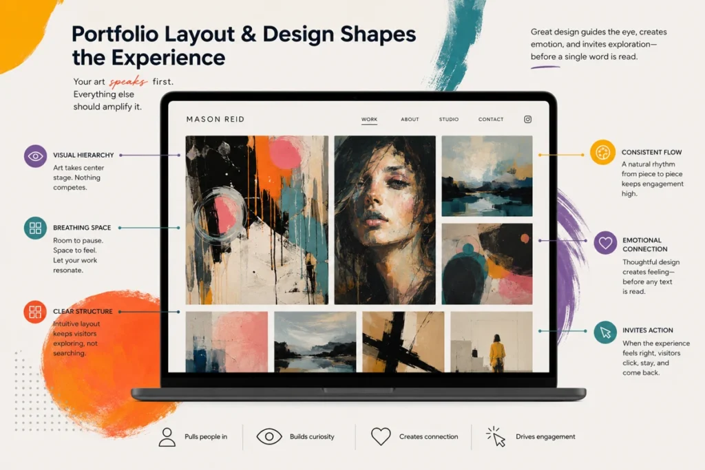
Your portfolio layout defines how visitors experience your art before they read a single word. And a good designer knows this well.
Let’s check out how small decisions around spacing, structure, and flow add up to pulls people in.
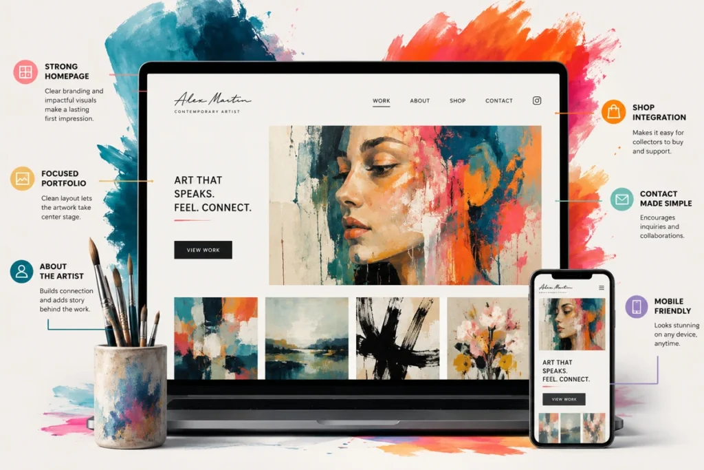
Clean Layouts That Let Your Artwork Speak
Most visitors decide within seconds whether a site feels worth exploring, and the layout is usually what tips that decision.
Keep these three principles in mind when building yours:
- Visual Clutter Costs You: Too many competing elements on a page push the viewer’s eye away from the artwork you want them to notice. Think of white space the way a gallery thinks of wall space in the room around a piece, as part of the display.
- Simple Navigation Wins Every Time: Users should find your portfolio, about page, and contact details without any effort. If they have to hunt for basic information, most will leave before they find it.
- Consistent Style Signals Professionalism: Matching fonts, spacing, and colours across every page shows first-time visitors that you take your work seriously. A web designer once told us the fastest way to lose credibility is inconsistency across pages.
A clean layout needs to stay out of the way to let your artwork do the talking.
Choosing the Right Images for Your Portfolio
Sharp, well-lit images can do more for your reputation since they help people see the detail, quality, and intention behind your work. Here’s how to approach it:
- Image Quality Is Essential: Blurry or poorly lit photos undercut even the strongest artwork. So invest time in getting your lighting and resolution right before anything goes on your site.
- Be Selective with Your Work: Eight strong images outperform twenty average ones every time. In practice, a smaller and more intentional selection helps viewers focus on your best work. It also makes your portfolio easier to navigate and more memorable.
- Video Adds a New Dimension: For performance art, pair a 90-second highlight reel with three to five production stills. Visitors can see movement before they see stills and understand the scale plus energy of the work.
Believe it or not, getting your images right is a one-time effort that pays off every time someone lands on your portfolio page.
How to Showcase Your Art Online Effectively
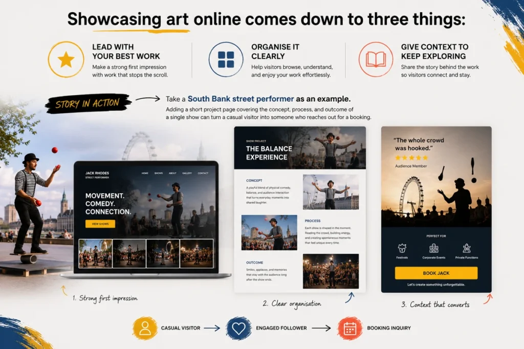
Showcasing art online comes down to three things: leading with your best work, organising it clearly, and giving visitors enough context to keep exploring. 3 strategies to break them down.
- Lead with Your Strongest Work: Put your best artwork at the top so that visitors can see it at a quick glance. So your past exhibitions can sit further back in the portfolio.
- Organise by Theme or Series: Grouping work by concept, medium, or series gives visitors a clear path to explore your portfolio. This works particularly well for artists with a broad history of work across different disciplines.
- Show the Story Behind the Work: Showing the process makes performance and installation work far easier for audiences to connect. A short write-up covering the concept and process behind a piece will work better.
Take a street performer at Federation Square as an example. If they add a short project page covering a single show’s concept, process, and outcome, it can help a casual visitor become someone who reaches out for a booking.
Content That Connects: Story, Voice, and Your About Page
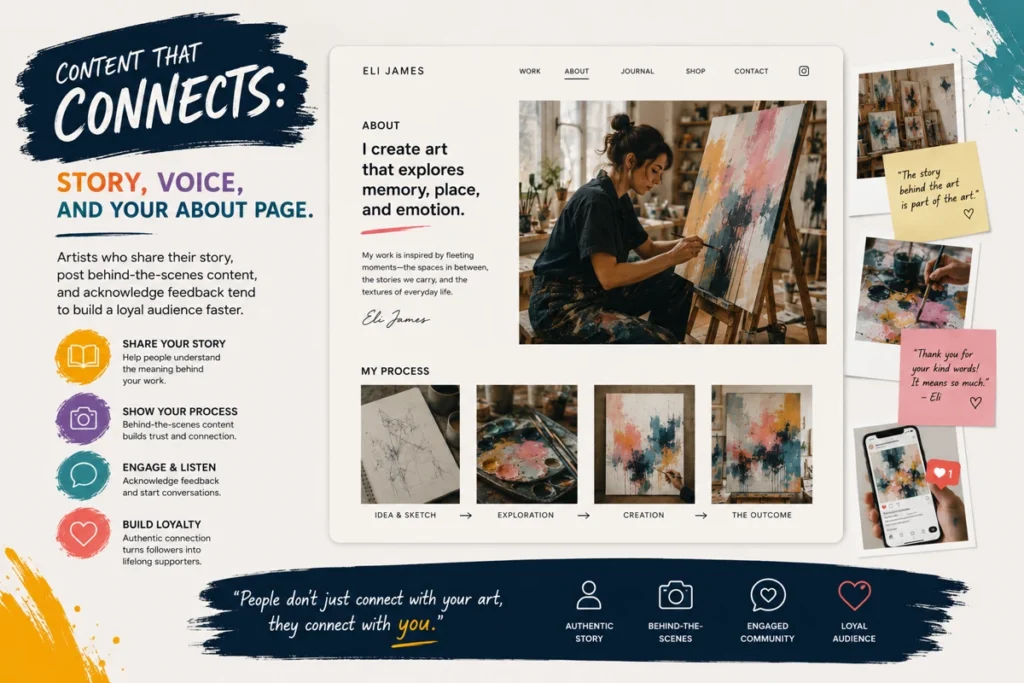
When did you last read an artist’s about page and actually feel something? That reaction is exactly what yours should aim for.
The about page is often the most visited page on an artist’s website. And a well-written page gives them a reason to stay and reach out. Writing in your own voice gives your brand a sense of personality that a list of credentials never can.
To strengthen this further, cover your process, your influences, and a bit of your history to relate to the audience. And don’t just stop there.
Artists who share their story, post behind-the-scenes content, and acknowledge feedback tend to build a loyal audience faster. That kind of openness demonstrates genuine engagement, and your community will notice.
Calls to Action and Engagement Tools Worth Adding
The right engagement tools turn passive visitors into people who actually get in touch, follow your work, or book you for an event.
A few things make the most impact :
- Make Contact Easy to Find: A visible contact form or booking enquiry button removes friction for event organisers ready to reach out. That’s why you should put it on every page, not just the contact page.
- Place Social Links Thoughtfully: Keeping social media links in the footer lets visitors discover your other accounts without pulling them away mid-browse.
- Add a Newsletter Sign-Up: A simple sign-up gives you direct access to an audience that has already shown interest. You can post updates, share new work, and stay connected without relying on a platform to do it for you.
Small additions like these do not overhaul your site, but they open doors that a static portfolio page never could. And for artists looking to grow sales or fill events, that access to your audience pays off fast.
Now Go Show the World Your Work
Your artist website is one of the most practical tools you have for sharing your work with the world. A clean portfolio featuring your best pieces, a page written in your own voice, and one clear way to get in touch is genuinely all you need to start.
Here’s a quick checklist to get your site live:
- A curated portfolio featuring your strongest work
- An about page written in your own voice
- One clear contact or booking enquiry button
- A store or pay link if you sell work directly
No Budget Performance has shown us that the artists who move their careers forward the most are the ones who simply begin. Many designers and creatives we have worked with treat their site as an ongoing project, and that is exactly the right approach.
If you are ready to join them, start today.