The Visual Elements That Make an Artist Website Memorable
First impressions of websites form in just 50 milliseconds, according to research from Google. That means performance artists lose bookings the moment their site looks cluttered or unprofessional.
The reason is simple. Your visual design choices communicate who you are as an artist before anyone reads a single word. In fact, the colours you pick and the spacing around your images all tell Brisbane bookers what to expect from your work.
In this article, we’ll walk through the specific design principles that guide visitors to actually book you rather than just browsing and leaving. We’ll cover the basic blocks you need to keep in your website, which layout you should choose, and how to create your portfolio page.
Let’s see what makes some artist websites memorable while others get forgotten.
Why Performance Artists Need Visual Design
Performance artists need visual design because it helps people trust them quickly, recognise their brand, and book them easily. Notably, the visual design can’t be average; it should be good, for sure. A good visual design combines colours, fonts, spacing, and layouts to create websites that feel professional and guide visitors to book you.
When someone searches for a performer in Brisbane, they’re comparing multiple artists at once. And if you have a unique visual design principle, people can find your contact details and booking information without hunting around the page.
To give you an idea, using the same colours and fonts across all your pages makes your brand easier to recognise. When art buyers see your promotional materials later at South Bank or in their inbox, those consistent design elements trigger recognition. That’s how visual design converts website visitors into actual bookings.
The Design Elements of Artist Website
Every website needs foundational design elements that complement each other. The colours you pick, the fonts you use, and the space around your content are the building blocks that either make your site feel polished or thrown together.
Let’s break down each one so you can see how they affect what visitors think when they land on your page.
Colour Palettes That Match Your Visual Appeal
Ever notice how some artist sites feel cohesive while others look thrown together? The reason almost always comes down to colour choices (trust us, we’ve seen the all-black-everything phase). In fact, colours can influence up to 90% of the decisions users make when they visit your site.
Which is why you need to choose 3-4 colours that appear in your performance photography or promotional materials. Warm colours like reds and oranges create energy, while cool blues feel calming.
Pro Tip: Test your colour palette on mobile screens where most Brisbane audiences will see your site, because what looks good on your laptop might feel too intense on a phone.
Typography That’s Easy to Read
The best part about picking the right fonts is that users can actually read your bio and booking details without squinting. From our work with Brisbane performers, we’ve found that it’s ideal to keep typography simple. It’s because this minimalistic mindset ensures better results, which is your ultimate goal, rather than letting it look fancy.
You might as well pick one font for headings and another for body text, but never more than two total. We say this because too many font styles make your site look messy. For instance, Sans-serif fonts like Arial work better on screens than decorative script fonts because they’re designed for digital reading.
Pro Tip: Keep your text size at 16 pixels minimum so people can read comfortably on phones without zooming in.
White Space Gives Your Work Room to Breathe
Poorly arranged websites make 37% of visitors leave before they even see your portfolio. Believe it or not, space is just as important as your actual content when you organise elements on a page.
When you add empty areas around images and text, it stops visitors from feeling overwhelmed by too much information at once. On the contrary, cramped layouts make sites look amateur even when the artwork itself is of professional quality.
White space doesn’t have to be white, by the way. Any blank area counts, so you could use a light grey or cream background with darker content sitting in that space.
How Visual Design Principles Keep Everything Organised
Maintaining visual design principles like grid layouts creates a professional look without costing you a fortune on design work. They work like invisible lines that keep your website from looking like a mess.
Think of them as the structure behind what users see. When you use a grid to arrange your portfolio images, text blocks, and buttons, everything lines up properly without you having to eyeball the spacing.
Here’s how grids can upgrade your website’s visuals.
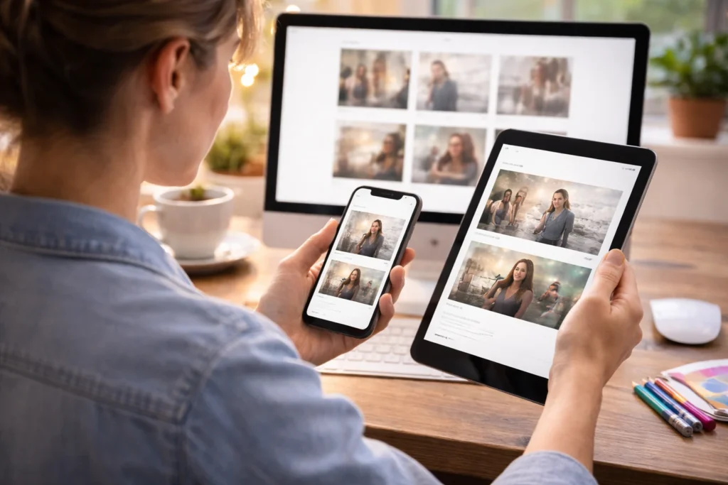
Column Systems That Adapt to Any Screen
Column grids are the fastest way to make your portfolio look organised without hiring a designer. Usually, three or four-column grids work well for portfolio pages where you’re showing multiple performances at once.
The smart part about modern grid systems is how content adapts automatically. Say, on a desktop computer, your layout might show four performance photos side by side, but when someone visits from their phone, those same images stack into a single column.
Pro Tip: Add gutters between columns to space out your images without needing actual border lines. It keeps the composition clean and lets your artwork breathe.
Alignment Creates Professional Polish
Alignment makes everything look intentional instead of random. When you line up your headings, images, and text blocks to the same invisible grid points, nothing looks out of place.
On the other hand, misaligned elements make your site look rushed even if the content itself is good. For example, when one image sits slightly higher than another, or a text block doesn’t line up with the photo next to it, visitors notice (even if they can’t explain why something feels off).
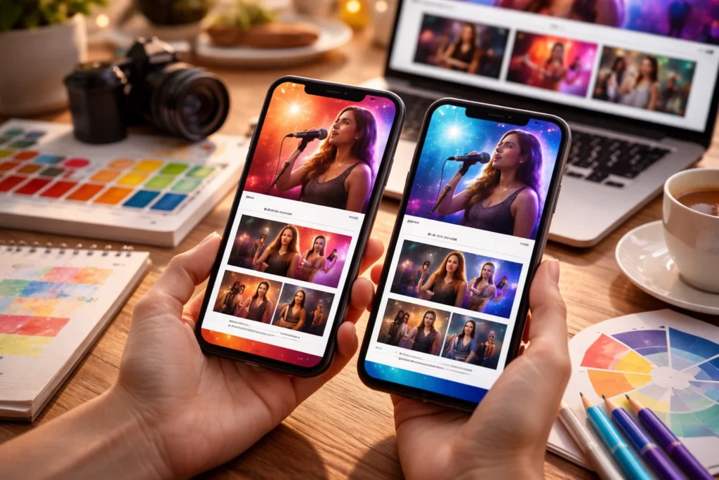
Portfolio Pages To Highlight Your Best Performances
Your portfolio is where visitors decide if they want to book you or keep searching for a different artist (because nobody has time for files that take forever to load). The way you present your artwork and performance images has real significance
And getting this right means focusing on two main things: image quality and video content that actually loads on mobile.
Take a look at how you can place your portfolio.
Image Quality and Placement
Your portfolio images need to be sharp, properly sized, and placed where users look first. Our tests with artist portfolios showed that clear photos get more engagement than artistic but blurry shots.
So place your strongest performance shot at the top where everyone sees it first, because that image creates the impression visitors carry through the rest of your site.
Pro Tip: Keep image file sizes under 200KB so pages load quickly on Australian internet speeds. This process might mean compressing your images slightly, but the trade-off is worth it when people can actually view your work without waiting.
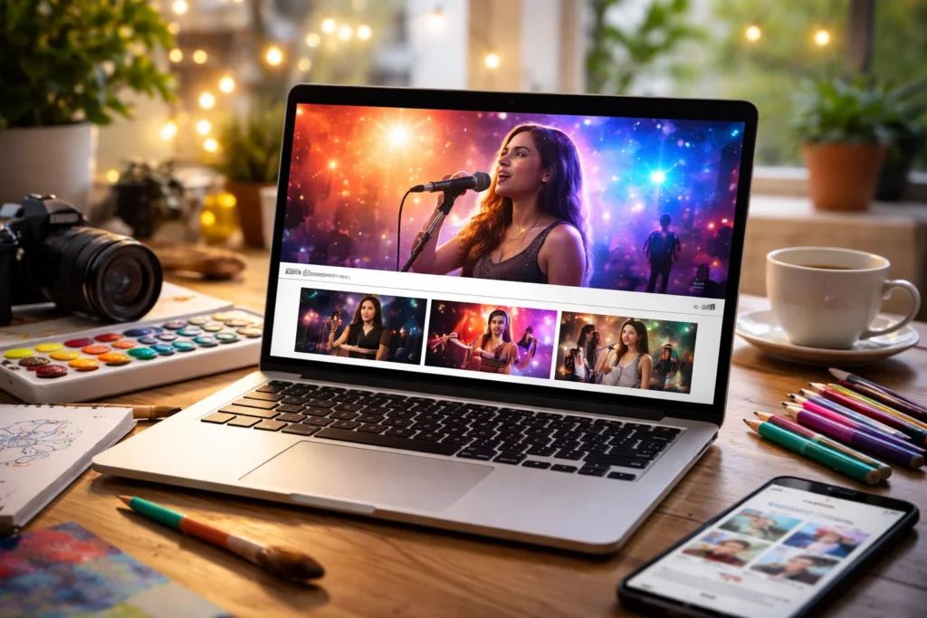
Video Content That Loads Fast
The easiest way to show your performance style is with a video that loads on mobile. Let’s be honest here, most people won’t sit through a 10-minute performance reel when they’re browsing on their lunch break.
We recommend embedding videos from YouTube or Vimeo instead of uploading directly to your site. It’s because those platforms handle the streaming and compression for you. Also, add a thumbnail image with a play button, so that users can control when the video starts playing.
Once the video begins, keep showcase videos under two minutes because that’s the sweet spot where you demonstrate your ability without losing your audience’s attention.
Start Building Your Visual Identity Today
Good visual design makes your site memorable to visitors when they’re comparing Brisbane performers. Thoughtful colour palettes, readable typography, clean layouts, and fast-loading portfolios all influence a client’s decision.
Most importantly, your design choices should reflect your artistic story while guiding visitors straight to your contact details. The goal is to create a site that represents your art and actually brings in bookings, not just looks pretty.
So focus on one section at a time instead of trying to rebuild everything overnight. Maybe test each change on your phone before publishing because that’s where most people will first see your work.
And if you think you can’t handle it alone, No Budget Performance specialises in building websites for Brisbane artists that balance stunning visuals with fast performance.