Speed Matters: Optimising Web Design for Fast Load Times
You click a link, and the webpage freezes. One second… two… by three, you’re already gone. Most people are. In fact, just a one-second delay can drop conversions up to 20%.
When your site runs slow, people leave fast. Search engines notice, your rankings drop, and potential customers slip away without a second thought. You might have a stunning design, but no one sticks around long enough to care.
This guide is here to fix that. You’ll learn how to speed up your site through smarter design choices like image compression, lazy loading, and cleaner code. We’ll skip the waffle and get straight to the things that make your site load faster and feel better.
Let’s get started.
How Speed Impacts Your Website’s Success
Speed can make or break your website. When a site loads quickly, it feels like walking into a clean, organised shop where everything’s right where you need it. But when it’s slow, it’s like being stuck behind someone having a problem with changes while the queue grows longer behind you.
So, what are the things that have a hand in making your website either miserable or successful? Let’s start with loading time and how it has a direct connection with the bounce rate.

A site’s loading time shapes first impressions, and that moment matters significantly. It influences the bounce rate, which refers to the percentage of people who leave after visiting just one page. According to Google, bounce rate jumps to 32% as load time increases from 1 to 3 seconds.
Then there’s Google’s Core Web Vitals, a set of metrics that measure real user experience. It looks at things like Largest Contentful Paint (LCP), which tracks how fast your main content loads.
Next, it considers First Input Delay (FID), which shows how responsive your site feels. Sites that don’t meet Google’s recommended thresholds risk lower search rankings. It’s their way of pushing us all towards faster, smoother websites.
Slow speeds simply make people leave and cause lower engagement as well as conversions. That’s why website speed optimisation is one of the smartest upgrades you can make.
Pro Tip: Use tools like GTmetrix or PageSpeed Insights to benchmark your site before going into fixes.
Image Compression: The Art of Keeping It Light
Let’s talk about one of the biggest factors that slows your site down: Images. The visuals on your website may look great, but without the right compression, they’re often silently ramping up your load times.
You solve this problem with Image compression. It is the process of reducing file size without a noticeable drop in quality. For example, a high-res photo might start at 4MB and then, when compressed properly, it might shrink to under 400 KB.
That’s a massive space saver and a step towards fast loading web design.
Why Images Are Usually the Biggest Offenders
Images can account for up to 70–90% of a webpage’s total weight. When left uncompressed or oversized, they slow everything down and lower the conversion rate. Optimising them can dramatically boost speed without sacrificing style.
Popular Tools: TinyPNG, Squoosh, ShortPixel
These tools make image compression easy:
| Tool | Pros | Cons | Cost |
| TinyPNG | Simple interface, good for bulk uploads | Slightly limited formats | Free up to 500 images/month |
| Squoosh | Works in browser, lots of control | Manual process only | Free |
| ShortPixel | Automated with WordPress plugin support | Free plan limited to 100 images/month | Paid (from $9.99/month) |
Choosing the Right Format: JPEG vs PNG vs WebP

Choosing the right file type for your images makes a bigger difference than most people realise. Here’s a quick look at how the most common formats compare:
| Format | Best For | File Size | Supports Transparency | Browser Support |
| JPEG | Photos and gradients | Small | No | Universal |
| PNG | Graphics, logos, UI icons | Larger | Yes | Universal |
| WebP | All-purpose (new standard) | Smallest | Yes | Widely supported |
Using WebP can reduce image size by 25 to 35% compared to PNG or JPEG, without compromising quality.
Using Responsive Image Sizes and srcset
Giant, high-res images are not needed on all devices. As a perfect solution, srcset tells browsers to load the right size image based on the user’s screen. This keeps things efficient and avoids loading huge files on mobile devices.
Also, responsive image practices help massively. They improve load speed, reduce bandwidth use, and make your site much friendlier for mobile users.
Automating Image Optimisation During Upload
Don’t want to optimise every image manually? Most CMS platforms like WordPress offer plugins that do the job for you.
Imagify starts with a free plan that gives you 20MB per month, with paid options from around $5.99/month. And Smush has plans starting from $3/month and upward through WPMU DEV.
However, if you’re using a custom build, tools like ImageMagick or Sharp can be set up in your development pipeline. These are free, open-source tools, but they do require a bit of technical setup.
Automating image compression means your uploads stay light without anyone needing to remember.
Lazy Loading: What It Is and How to Use It Right
After trimming down your image sizes, you’ll want to make sure your site only loads what’s needed, when it’s needed. Lazy loading is one of the most practical techniques in website speed optimisation that helps you achieve that goal. But the thing is, many sites still don’t use it properly or at all.

Lazy loading defers the loading of offscreen content until a user scrolls near it. Like, instead of loading every image on a long blog post at once, your site loads just the images in view. The rest load as the user moves down the page. This keeps the initial load time light and fast.
You’ll get the most value from lazy loading with below-the-fold images, embedded videos, and interactive maps. These elements usually take up more bandwidth and aren’t immediately needed. Delaying their load gives your user faster access to the visible content, which improves both experience and performance.
Two simple ways to implement lazy loading:
- Use the native loading=”lazy” attribute on images and iframes. This is the easiest way to lazy load images and iframes. Just add loading=”lazy” to your <img> or <iframe> tags, and the browser will delay loading those elements until they’re about to come into view. It’s supported by most modern browsers and works well for basic use cases without needing extra scripts.
- Use JavaScript libraries like Lozad.js or lazysizes if you need more control over when and how things load. Lozad.js is lightweight and easy to set up. It is great for simple websites. Contrarily, lazysizes is more powerful, with plugins and support for responsive images. It’s ideal for complex sites with different types of content.
Writing Clean Code: A Developer’s Hidden Superpower
Your website might look great on the surface, but messy code behind the scenes can drag down performance. A few hundred extra lines may sound easy to handle, but they can delay how quickly your site appears to users. Bloated scripts, duplicated styles, and unnecessary lines all slow down rendering. That’s a problem.
You get saved from it by writing Clean codes. It means writing code in a way that’s easy to read, easy to manage, and free from unnecessary clutter. For fast-loading web design, it also means browsers can render pages quicker and use fewer resources.
Here are some habits that will help you write clean code:
- Avoid inline styles and repetitive selectors: Inline styles load every time an element appears on your page, while repetitive selectors make your CSS longer and harder to manage. These styles and selectors gradually lead to bloated stylesheets that slow down rendering and make updates more time-consuming.
- Break CSS and JavaScript into modular chunks: Keeping code separated by function or page helps browsers load only what’s needed instead of everything at once. This approach reduces the amount of unnecessary code processed on each page, which speeds up load times and makes your site feel more responsive.
- Use tree-shaking and code splitting: Tree-shaking removes unused functions from your codebase, so the final package includes only what your site actually uses. And code splitting breaks your code into smaller chunks that load only when needed.
How to Audit Code with Lighthouse and Webpack Bundle Analyzer
You can’t fix what you don’t measure. Lighthouse is built into Chrome DevTools and gives clear scores on code performance. Meanwhile, Webpack Bundle Analyzer offers a visual map of your JavaScript files, showing what takes up space and what you can cut or split out. Run these tools regularly to keep your site lean and fast.
Minimising and Optimising Resources
After tidying up your code, the next step is to make everything your site loads as lean as possible. This includes scripts, stylesheets, and fonts.
Think of it like packing for a trip. Only bring what you need, and fold it tight. These changes might seem small, but together they have a huge impact on fast-loading web design.

Minifying CSS, HTML, and JavaScript: What It Does
Minifying means removing unnecessary spaces, line breaks, and comments from code. It doesn’t change how the code works. It just makes it smaller. This reduces file sizes and helps your browser load pages faster.
Combining Files Wisely vs. HTTP/2 Parallel Loading
With older servers, combining CSS and JS files reduced the number of requests. But if your server uses HTTP/2, you can load many files at once without a speed penalty. Here’s how the approaches compare:
| Method | Best For | Drawbacks |
| Combining files | Older HTTP/1.1 servers | Can load unnecessary code on some pages |
| Parallel loading (HTTP/2) | Modern servers and CDNs | Requires proper server configuration |
Hosting Fonts Locally vs. Third-Party Calls
Relying on external font services, like Google Fonts, means your site waits for another server to respond. Hosting fonts locally can cut down precious milliseconds and avoid render-blocking issues.
Real-World Example: Before and After Load Time
Pinterest rebuilt its mobile web experience with a focus on performance. After optimising images, minifying code, and delaying non-critical resources, they reduced load time by 40% and saw a 15% increase in SEO traffic, and a 44% increase in user-generated ad revenue.
This case study shows how strategic website speed optimisation not only improves user experience but also directly boosts growth.
Pro Tip: Avoid overloading your pages with unused libraries or fancy animations that don’t serve a purpose. If it’s not adding value, it’s slowing you down.
Caching and Content Delivery Networks (CDNs): Making Speed Global
Now let’s look at how to make your website faster for everyone. Caching and Content Delivery Network (CDN) work together to make pages load faster by reducing how often your server needs to do the heavy lifting.

Caching temporarily stores parts of your website (images, stylesheets, or even full pages) so browsers or servers don’t have to fetch them from scratch every time. There are a few types of caching:
- Browser Caching: This mechanism stores files locally on a visitor’s device after their first visit. And when they return to the site, the browser loads these saved files instead of requesting them from your server again. Browser catching reduces both load times and server strain.
- Server Caching: Your server retains rendered pages, database results, or API responses temporarily ready for reuse with this technique, so your site doesn’t rebuild content each time someone visits. Content delivery becomes much faster, especially for high-traffic or static pages.
- Object Caching: The server stores database query results to avoid doing the same work repeatedly here. It pulls data directly from memory to improve your site’s response times and decrease loads on your database.
Caching is gaining popularity because it’s one of the easiest ways to make sites faster without changing design or content.
How CDNs Reduce Latency for Global Users
A CDN stores copies of your website on servers around the world. Instead of pulling everything from your origin server, users get files from the closest location. That cuts down latency and speeds things up, which is especially important for international visitors.
Notable CDN Options: Cloudflare, Bunny.net, Fastly
Choosing the right CDN depends on your budget, traffic, and features. Here’s a comparison table for the three CDN options:
| CDN Provider | Starting Cost | Best For | Key Features | Considerations |
| Cloudflare | Free (Paid from $20/month) | General use and security-focused sites | Global CDN, DNS, DDoS protection, image optimisation | Some advanced features are available only in higher plans |
| Bunny.net | $0.01 per GB | Budget-friendly sites with moderate traffic | Flexible pricing, image optimisation, easy setup | Fewer developer-level tools compared to Fastly |
| Fastly | $0.12 per GB (pay-as-you-go) | High-traffic sites needing real-time control | Instant cache purge, edge logic, advanced analytics | Slightly steeper learning curve and higher base cost |
How to Set Cache Expiry Headers and Purge Content Safely
Cache expiry headers tell browsers how long to store certain files before checking for updates. Setting longer expiries for static content like images and scripts can drastically cut load times.
And purge tools let you safely clear old or outdated cached content when you update your site.
According to Cloudflare, proper caching can save up to 60% of data on repeat visits and significantly boost performance scores.
Mobile-First, Lightweight Design Principles
A mobile-first approach means building your site to work great on small screens before scaling up for larger ones. This strategy is important for fast-loading web design because mobile development forces you to cut out unnecessary clutter and prioritise functionality.

- Why mobile should come first in 2025: Mobile traffic is well past its growing stage. It’s now leading. Over 60% of global web traffic nowadays comes from mobile devices. If your site lags on mobile, you’re already losing users before they even scroll!
- Simplify the design: Smaller screens mean less room for mess. Remove background videos, oversized images, and interactive extras that don’t add value on mobile. Clean layouts and readable fonts go a long way here.
- Test before you launch: Use Chrome DevTools to simulate different devices and screen sizes. Run Lighthouse reports for performance insights and mobile-friendliness checks. Both are free and built into the Chrome browser.
When you simplify your site’s mobile performance, you are speeding things up for everyone. And that makes a real difference.
Regular Testing & Maintenance: Staying Fast Over Time
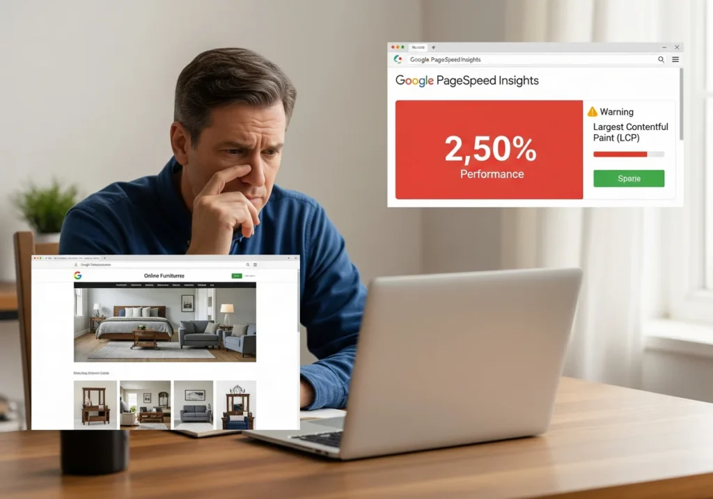
The next challenge is keeping your site fast over time. Speed isn’t something you fix once and forget. As you add new plugins, content, or features, your site can gradually slow down without you realising it.
Take Henry from Brisbane, for example. He runs an online furniture store. After installing a few new plugins and updating to a more visual theme, his load time increased by two seconds. He hadn’t changed anything major, but those small tweaks added up and made the site feel heavier.
Here are four reliable tools you can use to keep tabs on performance:
- PageSpeed Insights: It’s a free tool by Google that checks how well your site works on both desktop and mobile by looking at load time, how users can interact with your page, and visual stability. You get a performance score along with easy-to-follow suggestions for fixing any problems.
- GTmetrix: This website gives you detailed information about how your site loads. Their waterfall charts show how each part of your page loads and point out what’s making things slow.
- Pingdom: An excellent round-the-clock web monitoring tool for getting alerts immediately if your site goes down or starts running slower than normal. Its settings allow you to set custom alerts and get notifications through email or text.
- WebPageTest: You can test your website’s performance from various global locations and device types with WebPageTest. The tool provides in-depth information about load times and resource usage. Meanwhile, the filmstrip feature shows you exactly how your page loads step by step.
Keep an eye on TTFB (Time to First Byte), LCP (Largest Contentful Paint), CLS (Cumulative Layout Shift), and FID (First Input Delay). These are core indicators of healthy website speed optimisation.
Pro-Tip: After every plugin install or theme update, run a quick speed test. It’s a small step that can help you catch problems before your users do.
Speed Is How You Stay Competitive
If you’ve made it this far, you already know that website speed is a necessity. From compressing images and implementing lazy loading to cleaning up code and running regular performance checks, every step helps build a fast-loading web design that keeps people around and drives results.
We’ve covered how slow speeds discourage visitors, how the right tools and techniques can give you a serious edge, and how speed ties directly to SEO, conversions, and overall user experience.
If you’re ready to turn what you’ve learned into action, the next move is simple. Visit No Budget Performance to see how our custom optimisation services can help you speed things up without wasting your budget. Because every second counts, and we’re here to help you make each one faster!