Website Design Ideas For Theatre And Performance Projects
If your site isn’t bringing in bookings, weak theatre website design is likely the problem behind it.
We’re No Budget Performance, and we’ve helped Brisbane performers turn flat, forgettable sites into ones that bring in real enquiries. We design and rebuild websites for performers, so we’ve seen exactly what turns a browser into a booking.
And this guide focuses on exactly that gap. You’ll find layout choices that hold a visitor’s attention and content decisions that belong on your site. A few small structural changes can also bring in more bookings, all without hiring a developer.
Every idea in this guide fits your budget first. And it’s built from what we’ve seen work across dozens of Brisbane theatre and performance sites.
Creating a Performance Site Layout Visitors Actually Stay On
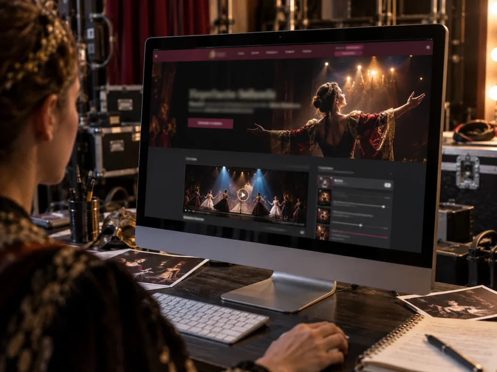
Most visitors decide whether to stay on your site within a few seconds of landing. That first impression either pulls them in or sends them back to the search results.
Two things decide whether visitors stick around: what they see first, and how easy your site is to move through.
Art and Visuals: What Your Homepage Needs to Say Up Front
The right homepage visual does half your marketing before a visitor reads a single word. So, your hero image or video should show art that comes from an actual show.
Your homepage works hardest when it includes the following three elements:
- Real Performance Footage: A short clip shows a visitor your style in seconds, something a paragraph of text struggles to do. It captures movement and energy that a static photo simply can’t hold. Just 15 seconds is usually enough to make a strong first impression.
- Visual Hierarchy That Guides the Eye: If your name, style, and contact details sit below the scroll line, most visitors will never find them. So keep your name, style, and contact details above that line. A visitor shouldn’t need to scroll just to learn who you are.
- Fonts and Colours That Match Your Style: Bold, theatrical performers suit bold typography. And quieter, minimal acts often work better with softer palettes and simpler layouts. For example, a drag queen’s site might use bold neon colours, while a classical dancer’s site might use muted tones and serif fonts.
Get the footage, the layout, and the style right, and your homepage starts doing your marketing before a visitor reads a word.
Site Structure: Where Most Performance Pages Lose Their Audience
Too many menu options force a decision nobody wants to make, and most visitors won’t bother working out where to click next. They’ll simply leave and try a competitor’s site instead. When you’re building or updating your site, keep an eye out for these structural habits:
- A Short, Clear Menu: Five pages or fewer, each with an obvious purpose, stops visitors from feeling lost. A confused visitor rarely sticks around to figure things out.
- A Path That Leads to Contact: Every page should give a visitor an easy next click, whether that’s your bio, your shows, or your contact form. A dead end sends them back to search results instead.
- A Mobile Layout That Works Properly: Many performers check competitor sites on desktop but never test their own on a phone. Most visitors will find your site on mobile first. A layout that breaks on a small screen loses bookings before they even start.
If you trim your site down to the necessary pages, more visitors tend to reach your contact page, simply because there’s less standing in the way.
What to Put on a Performance Art Website (And What to Cut)
A performance website only needs a handful of pages done well. Many performers add extra pages over time without a clear reason, and they often bury the ones that the visitors actually came to find.
This table breaks down what to keep and what to drop.
| Include This | Cut This |
| A shows page with dates and venues | A blog you won’t keep updated |
| A short artist bio with real details | A lengthy press history nobody reads |
| A tight photo or video portfolio | Every photo from every show ever |
| One clear contact page | Multiple scattered contact forms |
Quick Tip: Before adding a new page, ask whether it helps a booker decide or just adds one more thing to keep updated
Creating a Shows Page That Gives Visitors a Reason to Stay
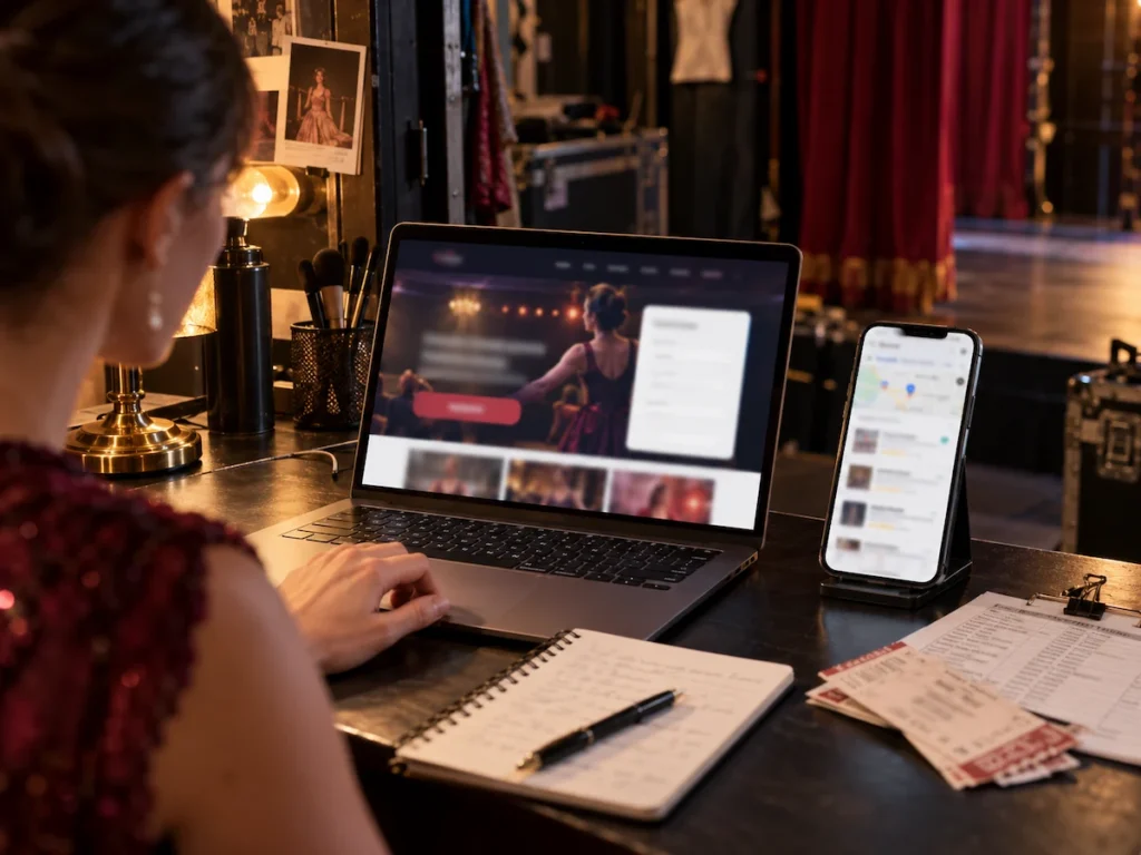
As we already mentioned, a shows page needs dates, venue names, and a short description for context. Without these basics, visitors have to guess whether a show has already happened or is still worth planning around.
Your shows page should include these details:
- Clear Dates and Venues: List shows in date order, with the venue and one line of context. Nothing more, nothing buried, just what visitors came to find. A visitor scanning on their lunch break should get the full picture in seconds.
- Photos or Video From Past Shows: A careful selection of one strong clip builds more trust than a dozen scattered photos. It shows visitors exactly what they’d be booking well before they ever make contact. Try filming from the crowd’s viewpoint rather than backstage. It tends to feel more authentic to visitors deciding whether to book.
- A Direct Link For Each Upcoming Show: Structured data adds event details in a format search engines can understand. This can help Google display your show dates and venues directly in search results instead of showing only a plain link.
Get the dates scannable, the footage authentic, and the search visibility sorted, and your shows page stops being a formality visitors skim past.
A visitor who’s excited about your shows still needs a clear way to reach you, and that’s where a lot of performance sites fall short.
The Contact and Booking Section of Most Performance Sites Gets Wrong
A contact form with no context about response time or booking process loses warm leads. Visitors who don’t know what happens after they hit submit often just give up and look elsewhere.
A stated response time fixes most of that problem on its own. If visitors know you’ll reply within two business days, for example, they don’t have to wonder whether you’ve received their enquiry or when they’ll hear back. Your typical booking lead time gives them the same clarity about availability, showing whether your schedule fits their timeline.
Accessibility deserves a mention too. Screen reader users rely on image alt text to follow your site, and sighted visitors get the same photo information without any extra explanation.
Creative Website Ideas for Showcasing Theatre Work Without a Big Budget
A professional look online does not require a professional budget, just the right tools used well. Even so, a polished site is possible when your total spend sits close to zero.
Embedded video from Vimeo or YouTube is one of the easiest ways to show your work without paying for hosting. Upload a short clip of your performance, drop the link into your site, and visitors get a full sense of your style in under a minute.
Your portfolio can benefit from the same low-cost approach. A single, well-built portfolio page often works better than several half-finished gallery sections spread across your site. So pick your strongest 10 or 15 images and give each one enough space to make an impression.
The same principle applies to your press kit. Canva offers free templates that you can customise with your own photos and information. A free template, designed with your own photos, goes a long way toward looking established.
Believe it or not, none of these ideas need a web design background or a team of experts behind them. They just need a bit of planning before you add anything to your site.
Creating a Theatre Site That Brings in Booking Enquiries
Now that your layout and content are working together, it’s time to focus on enquiries. Your current site can look great and still fail at its one important job: getting people to reach out.
A few structural choices turn your site’s visibility into bookings:
- A Clear Call to Action: Every page should give visitors an obvious next step, whether that’s a contact form or a booking link. Guesswork sends visitors away without ever making contact.
- Basic Search Engine Details: Your site’s page titles and descriptions decide whether bookers find you at all. Clear titles and descriptions help your site stand out in search results and earn more clicks from bookers searching nearby.
- A Connected Google Business Profile: Linking your site to your profile increases local visibility for Brisbane performance work. A booker checking your reviews before they’ve even opened your site isn’t unusual.
Adding one clear call-to-action per page tends to bring in more enquiries than a single contact page buried in the menu. And most of these changes take a single afternoon to put in place.
Small Website Changes That Lead to More Theatre Bookings
Small design decisions, like load speed and clear navigation, cost performers bookings they never see happen. None of them requires a full rebuild or a big spend.
We’ve watched performers go from a static bio page to a site that brings in bookings on a regular basis. The right choices, made early in your career, tend to pay off for years afterwards.
If your site needs work, start with one section this week, whether that’s your homepage, your shows page, or your contact form. And if you’d rather have a professional handle it, get in touch with us and we’ll help you turn your site into one that brings in bookings.